


Reporting in CAASie
The primary way to view data in CAASie is in the dashboard of your respective campaigns. Here, you’ll get a live graph of all the plays, costs, and associated boards. This is the preferred way for data visualisation.
Alternatively, you can export various pieces of data from the platform for use within your data visualisation tool of choice.
Live Data (Campaign Dashboard)
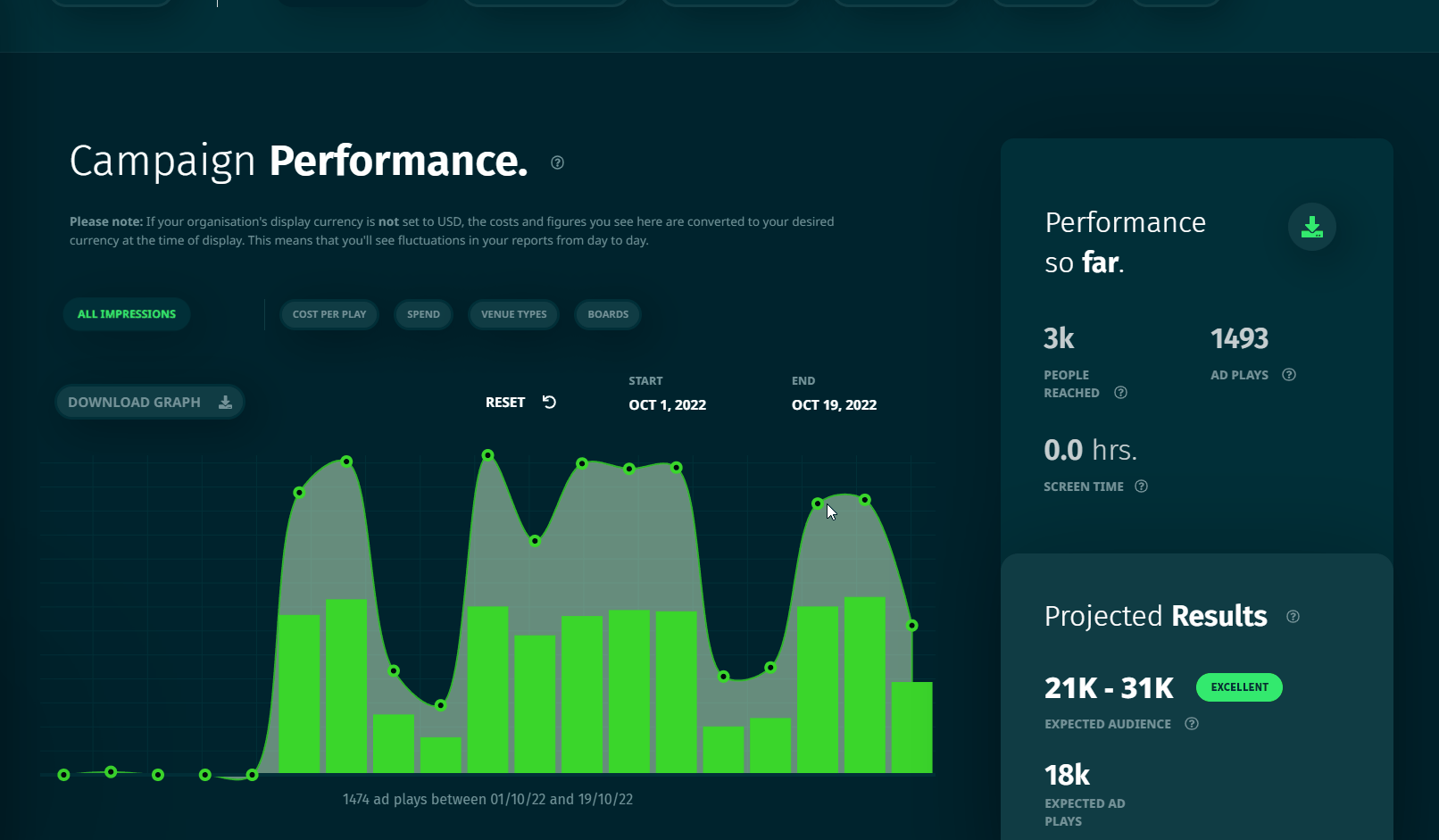
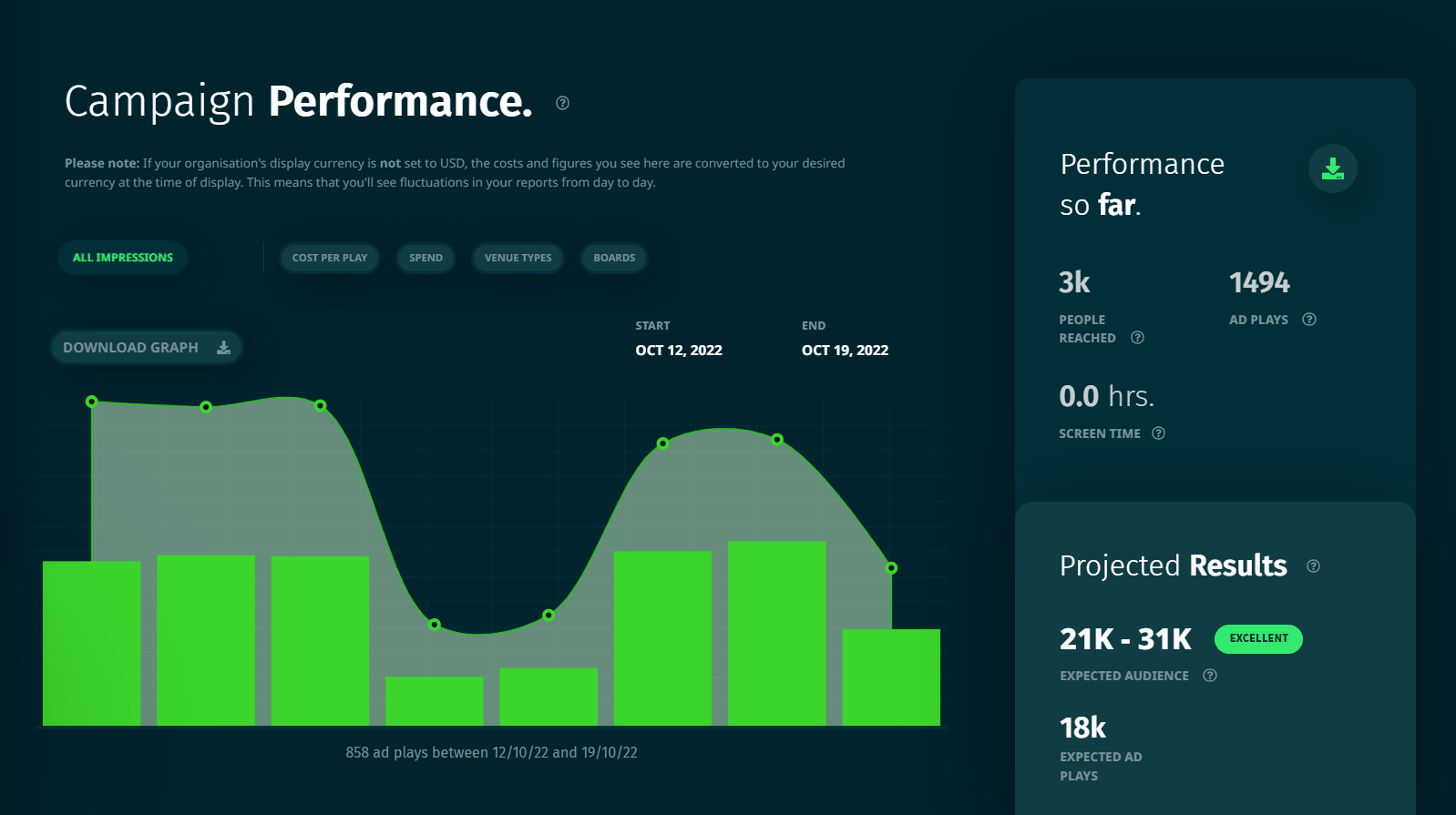
In each campaign dashboard, you’ll find a performance tab. The performance tab hosts various pieces of information for you to observe how well your campaign is…well, performing. The key metric on CAASie is the number of ads you’ve served, which in turn is a measure of the number of people your ads (likely) reached.
You can navigate through the following graph types. We’re not going to include all the screenshots here, but you’ll get the idea.
Date Window
First of all, before you check out the graphs, it is important to set the date window within which the campaign data is being collected. In other words, the graphs only show the plays that have occurred between the start and end dates that you’ve set here.
You can easily change the start and end date by clicking on the respective “start” and “end” times and adjusting them. You’ll see the graph refresh to accommodate the new dates.
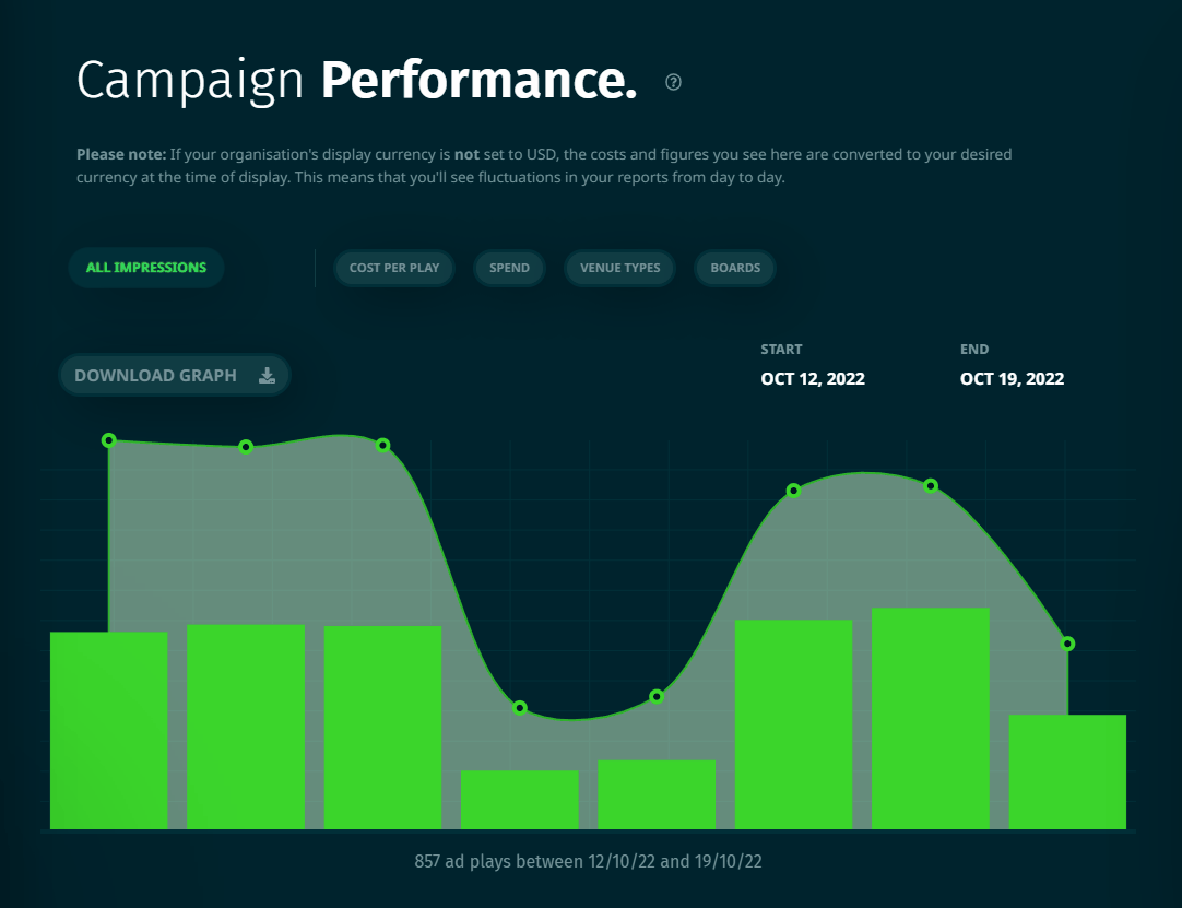
So, if you jump on your dashboard and see no plays on the graph, chances are your date window just doesn’t include any plays. Try setting the start date a few days earlier, and the end date a few days later.
Play History
The play history graph is what it sounds like - a history of all the plays that have occurred in your campaign.
The green bars in this graph represent the number of plays, while the line (and dots) represent the number of people reached by your campaign within the date window.
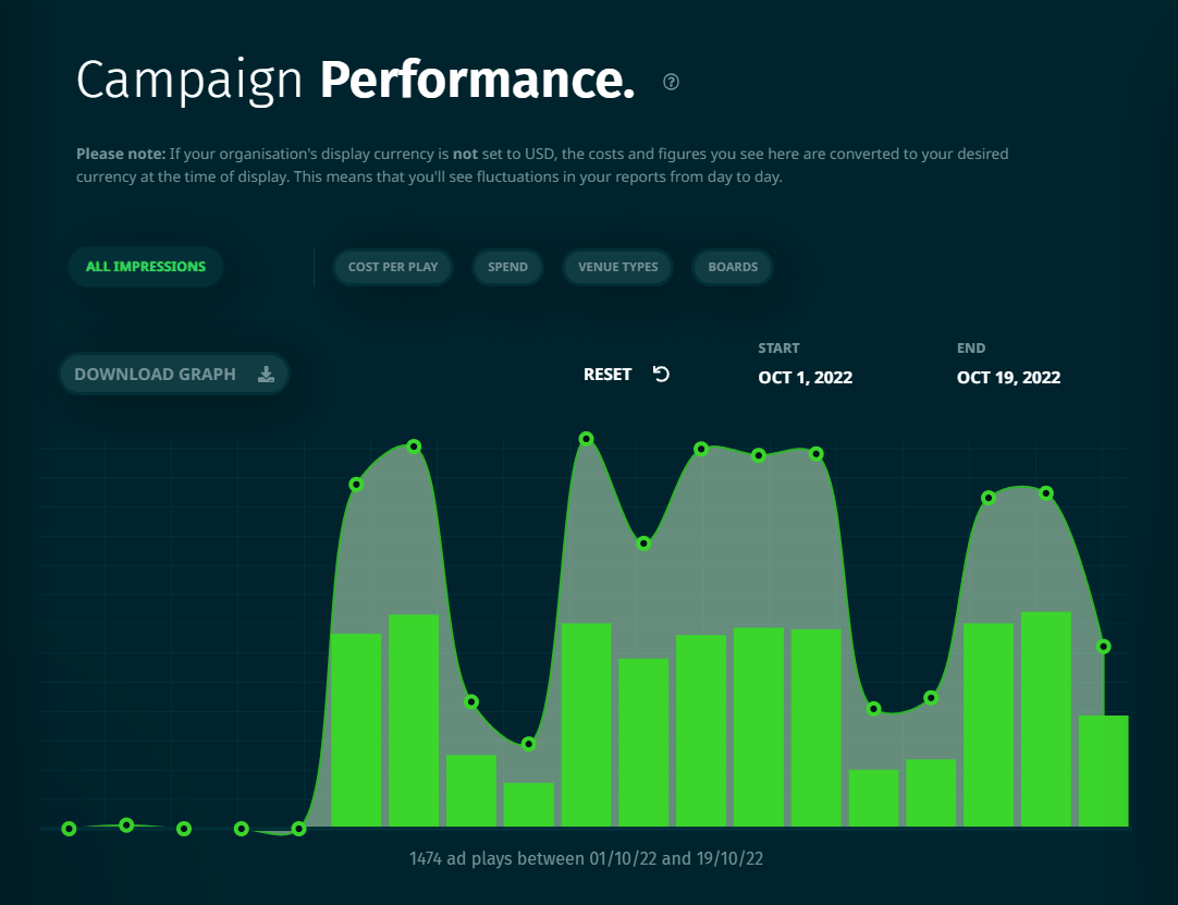
By default, the graph shows a breakdown by day. You can click into individual bars to see the breakdown by the hour of that specific day. This is handy for checking to make sure your campaign is running within schedule.
Spend history
Similar to the play history graph, the spend graph shows you the overall campaign spend by day (default) and clicking into it shows you the campaign spend by hour of day if necessary.
Cost Per Play
Depending on whether you’ve clicked into the graph or not, the cost-per-play graph shows you the average cost-per-play by the day or by the hour. The green bar shows you the average, while the line/mark graph shows you the maximum cost-per-play within your selected timeframe.
Hovering over each bar will also show you the minimum cost-per-play for that timeframe.
Use this to decide if you want to cap your max cost per play in your spend control.
Plays by Venue Type
The venue type graph attempts to categorise your campaign’s plays by the venue type of the board the play occurred on. Bear in mind that the venue type is supplied by the media owner and is entirely subjective. For example, some fuel stations are categorised as “Gas Stations”, while others are categorised as “Convenience Stores”.
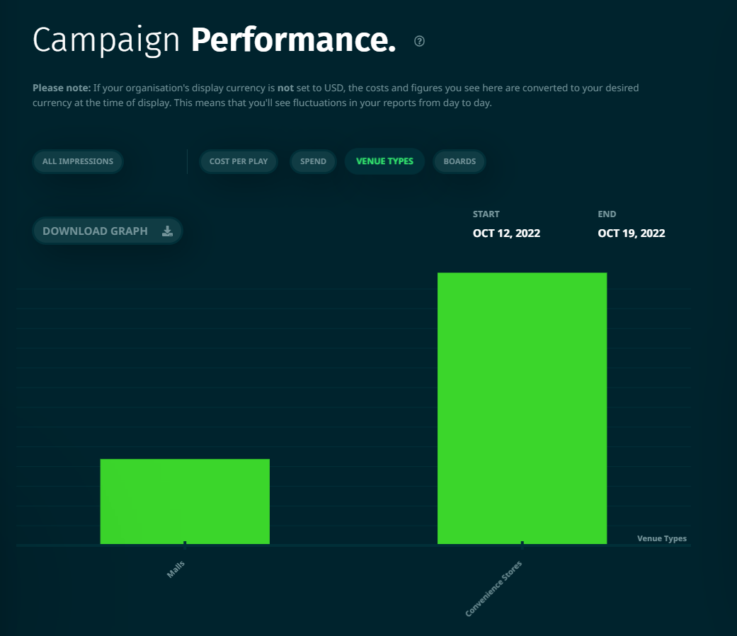
The impression breakdown by venue type will give you an idea of which venue types are consuming the lion’s share of your campaign plays. It doesn’t give you an idea of how much spend is being allocated to those venue types, however. So you may notice that venues that cost less (per play) or request ads more frequently will have recorded more plays, and thus have a longer bar.
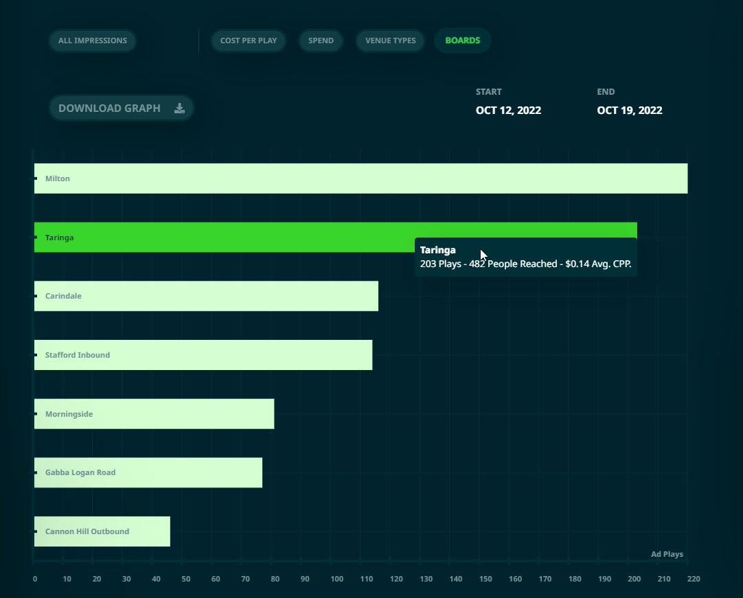
Plays By Board
As the name suggests, you can view the plays categorised by the board that they occurred on. This is particularly useful if you’re trying to see which boards are consuming the majority of your campaign’s budget. Unlike the venue type graph, this does show you both the number of plays (and audience reached), as well as the average cost-per-play that you’ve incurred for the board in question.
Data Exports
Data from your campaigns can be exported in either graphable or raw data formats.
Graph Data
Each of the graphs mentioned above has the ability to be exported. Above them is an aptly-named button that says “Download Graph”. Clicking on it will compile the graph into a CSV file for you to graph on your own however you like. Yay.

Raw Data Dump
If you’re not interested in a specific graph, then CAASie also has the ability to dump a campaign’s raw data into a CSV file. Be warned though. This is raw data in the absolute sense of the word. You’re downloading every single play your campaign has ever generated.
To get the raw data dump, just head on over to the performance section of the campaign (which, if you’ve been following the above examples, you already are in). And to the right-hand side of your graphs, click the large download button. This will generate the full data dump over the next few seconds and should automatically download itself to your computer.


