


Billboards, Burgers, and the Return of Wingdings: Macca’s Goes Cryptic
I don’t know about you, but when a billboard suddenly starts speaking in riddles, I pay attention. Especially when those riddles are written in Wingdings. Yes, Wingdings, that chaotic 90s Microsoft font we all once mistook for some kind of secret code (and, let’s be honest, used for exactly that in primary school newsletters).
Well, turns out McDonald’s just brought it back, and not just for a quirky nostalgia hit, but to launch a brand-new campaign (their first with Wieden+Kennedy Sydney, no less.
Now, if you haven’t spotted the strange symbol-filled billboards popping up across major Aussie cities this week, let me catch you up. In true cryptic fashion, McDonald’s teased the nation with giant out-of-home (OOH) placements that looked like your printer had a stroke. But those of us fluent in 90s iconography could tell something was going on.
It didn’t take long before the puzzle was solved, revealing a statement that was almost as ambiguous as the symbolic writing: Peak Chicken Is Upon Us.
Ah Wieden+Kennedy, you have outdone yourselves. Some riddlers realised the likely meaning rather quickly, and you really just have to read between the lines to see it.
“Peak Chicken” + Wingdings font = Chicken wings. What a dad joke.

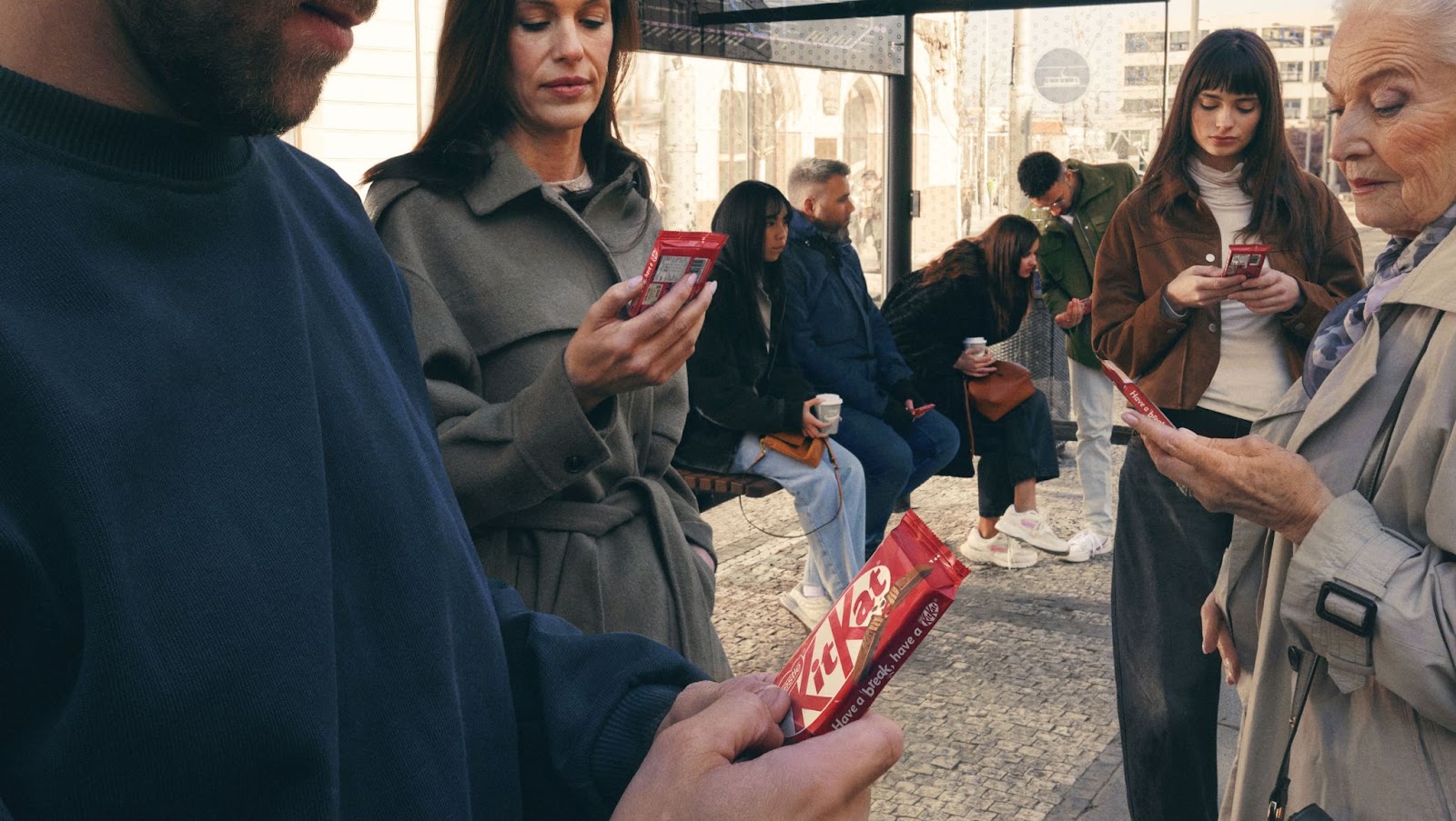
It’s all in honour of Chicken McWings, the newest (and now permanent) addition to the Macca’s chicken dynasty, joining legends like the McChicken, McSpicy, McCrispy and, of course, the nugget. Amanda Nakad, Macca’s marketing director of menu and brand, declared it “the golden era of chicken at Macca’s”.
How to wing it, perfectly
The original Wingdings billboard is stripped back to the essentials: signature Macca’s colours, a cheeky nod to the golden arches embedded in the typeface, and a layout so familiar it screams McDonald’s, even without saying the name.
The follow-up image clarifies the message, revealing the McWings name, the product, and the playful font in all its nostalgic glory. Still simple, bold, and unmistakably Macca’s - that’s what makes it clever. The creatives leaned into what the public already knows about the brand, trusting that most people would connect the dots without needing a big logo or wall of copy.
By combining an iconic font and an iconic brand this can be done in a very minimalistic way. However, if you don’t have a recognisable brand like McDonalds, don’t fear - the message here is about simplicity and creating a moment that makes viewers do a double-take. Yes, Macca’s has the advantage of being one of the most recognisable brands on the planet, but this campaign isn’t about brand scale. It’s about restraint, and creating a visual that makes people stop and read. That’s something any brand can aim for.
The campaign started with mystery and now continues with gusto, rolling out across radio, socials, video, and more outdoor executions. There are even cinematic comparisons being thrown around in their campaigns, referencing Cleopatra, the Renaissance, dinosaurs and the Mona Lisa, all to mark this cluckin’ cultural moment.
Wieden+Kennedy take the reins (and the wings)
I’m feeling dad-joke inspired today.
Behind the scenes, this is Wieden+Kennedy’s first creative drop since winning the Macca’s Chicken and McCafé portfolio earlier this year. If you’re wondering, yes, this is the same W+K that already works with Macca’s in the US and Canada (they've checked another one off the list!).
While their Sydney office had a rocky PR moment when their initial local hires were criticised for lack of diversity (a fair critique if you ask me, I haven’t seen any other outspoken digital platform assistants yet), the agency has since clarified that hiring is still ongoing and inclusivity remains a top priority.
Back to the billboards, though, this was a clever play. Teasing out interest with visual gibberish not only gave Aussies a collective decoding challenge (a rare bonding moment for commuters), but also spoke to a deeper layer of cultural nostalgia. Wingdings was never meant to be a “font” in the traditional sense - it was a collection of symbols meant for piecemeal use - e.g. bullets, icons, little pictorial flourishes for documents. But humans, as you do, turned it into something it was never intended to be: a code, a language and a conspiracy magnet.
McDonald’s and Wieden+Kennedy tapped right into that. The way Wingdings wriggled into pop culture, urban legends, and desktop lore, and then recontextualised it on the street. You don’t need to know your Helvetica from your Garamond to appreciate the joke. It’s simple: nostalgia + mystery = attention.

Of course, the Macca’s machine doesn’t stop there. Alongside McWings, the brand is also giving its coffee lineup a glow-up. The new McCafé blend comes with its own suite of hero spots, clean, comforting, caffeine-friendly films aimed squarely at those of us who believe our day doesn’t start until our mug says it can. These are backed up by radio, influencer content, social, and (you guessed it) more OOH.
It’s all part of a bigger strategy: to turn everyday menu upgrades into culture-shifting events. Judging by how fast the internet jumped on decoding those billboards? They’re doing it right.
If this campaign proves anything, it’s that a little mystery, a whole lot of brand confidence, and some clever OOH thinking can go a long way. Now with programmatic billboards in the mix, updating your creative once the secret’s out is as easy as swapping your McNuggets for McWings.
That’s where I come in. On my platform, you can test, tweak, and launch out-of-home ads just like this, with no massive budget or mystical font knowledge required. Just smart creative, smart media, and a platform (hi, that’s me) built for campaigns that turn heads on the street.
Let’s get your message up in lights, even if it starts out in Wingdings.


Get on the big screen.
I know what you're thinking.
"Hey, CAASie, you're so cool. I want to use you for my next marketing campaign".
Well, you're in luck.
SIGN UP - for free


Your ads in
...
Only pay for what you use. No upfront costs.
Just you, your ads, and billboards.
