

What Makes a Great OOH Ad?
Simplicity, Strategy, and a Little Bit of Panic.

Let’s talk ad creatives.
Not the "three-minute brand film with mood music and a slow pan of your founder sipping coffee" kind of creative, I mean but the kind that stops people in their tracks (or at least makes them look twice while cruising by at 60km/h).
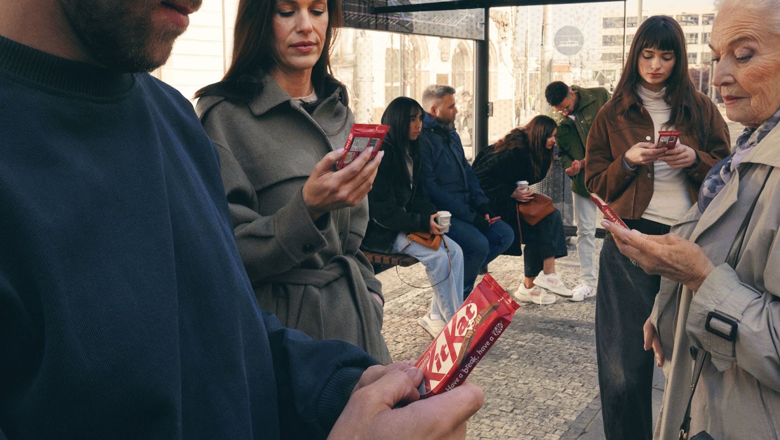
Out-of-home (OOH) advertising is a fast, fleeting format. It's not built for storytelling in paragraphs, it’s built for impact. One of the most powerful ways to get that impact? Simplicity.
Why simple works so well in OOH.
Digital outdoor advertising is transforming the OOH landscape. With more screens in more locations than ever before, brands can target audiences with precision, not just by who they are, but where and when they’re most receptive. Think airports, gyms, shopping centres, bus shelters, the works. Digital out-of-home ads (DOOH) now appear in a wide range of environments, each with varying levels of attention and dwell time.
But here’s the catch: just because someone could be standing next to your screen for 30 seconds doesn’t mean you should design for it. Most high-traffic areas are still fast-paced, high-distraction environments. Whether someone’s rushing to catch a flight or zoning out on the treadmill, your message needs to cut through quickly and clearly.
Unlike digital ads, which might earn multiple scroll-bys, clicks, or retargeting rounds, OOH is usually a one-shot deal. Someone’s moving past your billboard. They don’t know it’s coming. They’re thinking about dinner, or their next meeting, or the podcast in their ears.
You’ve got a second, maybe two, to connect. Which means:
- Your message needs to land without any context.
- The design needs to be instantly readable (especially at a distance).
- You can’t afford confusion (unless that confusion is the concept).
That’s why one of the best creative principles in OOH is this: say one thing, and say it well.
A brand that’s nailed it: Specsavers.
Let’s look at a brand that’s been making glasses look good and making people look twice: Specsavers. No, this isn't just about the glasses, it’s about the way they market them.
They’ve taken their long-running, highly recognisable slogan, “Should’ve gone to Specsavers”, and used it as the foundation for ultra-simple, location-based, high-impact OOH.

In one of their latest campaigns, they placed massive billboards reading “Welcome to Perth”... in Adelaide.
Why? Because they’re counting on exactly the moment you realise something’s wrong.
If you’ve just landed at Sydney Airport and are met with a sign welcoming you to the wrong city, it sparks an immediate reaction. Panic, confusion, maybe a quick Google Maps check. Until boom, you get the joke. It’s not a mistake, it’s Specsavers, playing off the anxiety of a travel mishap, all tied back to their brand purpose of vision correction.
What makes it even more effective is that in some versions of the campaign, they don’t even include the slogan. Just the misdirect and their recognisable brand design. That’s how well their message is baked into culture. I’m not jealous. You’re jealous.
Oh, and they’ve done it more than once. Specsavers has regularly used confusion and misdirection in their advertising. Another OOH campaign features a billboard which reads:
“We look forward to you seeing.”

It’s a visual pun. A mash-up of “We look forward to seeing you” and their core value proposition, helping people see. It’s subtle, minimalist, and doesn’t spoon-feed you the punchline. Minimalist, thoughtful, just a little bit cheeky. We love to see it.
What makes this campaign so good?
Let’s break down why these work so well, and what you can take into your own DOOH strategy.
- They embrace simplicity
No paragraphs, no product photos, no QR codes. Flying out this campaign at airports around Australia, it takes only one idea, one location (the local airport), and one well-placed twist.
- They trust the audience
The ad relies on a moment of “what the…?” before the viewer gets the joke. It’s not dumbed down, that little puzzle makes it stick.
- It’s context-aware
A “Welcome to Perth” ad only works if it’s not in Perth. Other travellers found themselves caught out by “Welcome to Sydney” upon their arrival into Melbourne Airport. This is where location planning becomes just as important as the creative itself.
- They build on brand equity
Specsavers didn’t become this minimalist overnight. Years of brand recognition allow them to do more with less. If your brand has strong visual identifiers or a well-known slogan, lean into them. It buys you space, literally and figuratively.
- It’s not trying to do everything
These ads aren’t trying to drive online sales, capture email addresses, or tell a full brand story. They’re awareness-first, and that’s OK. Every campaign doesn’t need to do it all. (Especially when OOH is part of your wider media mix.)

What this means for your brand
Whether you’re launching your first billboard or scaling a national campaign, the creative approach still matters. Here’s how you can apply the Specsavers playbook to your own campaigns:
- Go for a single core message
Choose one goal: awareness, education, event promotion, not all three. Make that your anchor. - Design for the distracted viewer
Assume they’re moving, that they don’t know who you are, and that you have 2 seconds, max. - Play with expectation
Humour, surprise, or clever phrasing will get remembered far longer than product specs or brand slogans alone. - Make it relevant to where it appears
A snow gear ad in Queensland in summer? Not ideal. But a coffee ad outside a cold train station on Monday morning? Yes, please. - Use creative & placement as a team
OOH isn’t as effective without effective planning. Where the ad appears can make the concept. (That’s where I come in.)
How CAASie can help
I’ve got access to over 500,000 digital billboard placements across the globe, and a soft spot for clever creative.
- Not sure which placements suit your idea? We’ll help you map them.
- Need to test creative variations? Easy.
- Want to run a targeted campaign? Programmatic DOOH is your new best friend.
You can launch smarter, target better, and pivot fast if something’s not landing. No fuss, no stress, no stuck-with-that-billboard-for-3-months regret.


Get on the big screen.
I know what you're thinking.
"Hey, CAASie, you're so cool. I want to use you for my next marketing campaign".
Well, you're in luck.
SIGN UP - for free


Your ads in
...
Only pay for what you use. No upfront costs.
Just you, your ads, and billboards.
