
Welcome to another CAASie update.
This time, a considerable portion of the platform has been dismantled, reorganised and returned in a more cooperative state. The campaign tools are clearer, the mobile experience behaves properly, and several workflows now require fewer acts of blind faith.
Progress, I’ve been told.
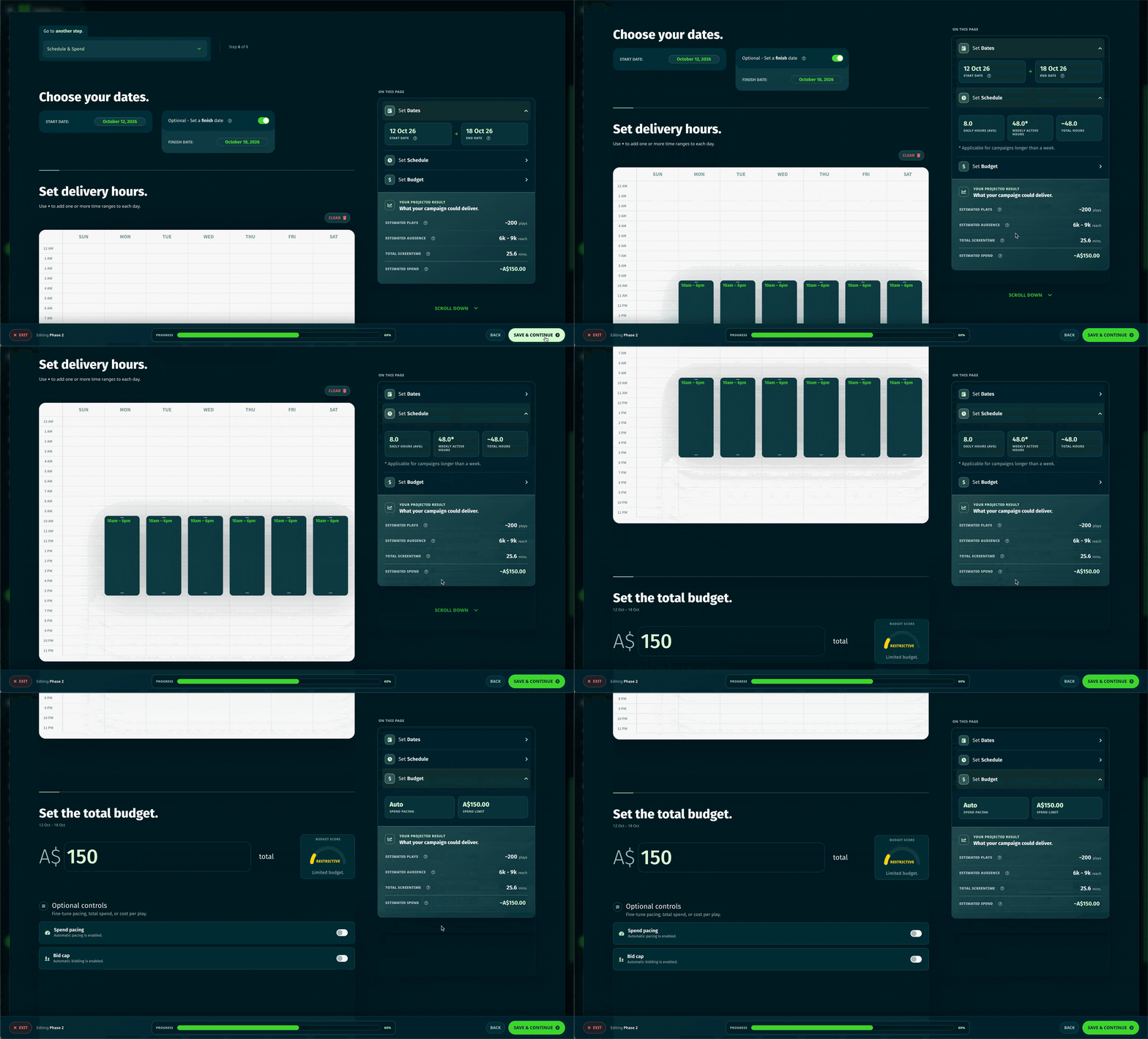
Creating a campaign used to involve a collection of perfectly reasonable steps arranged in ways that were occasionally less reasonable.
The campaign builder has now been substantially redesigned, with:
You can now see what your campaign is expected to deliver, understand which settings are optional, and move between steps without me developing selective amnesia.
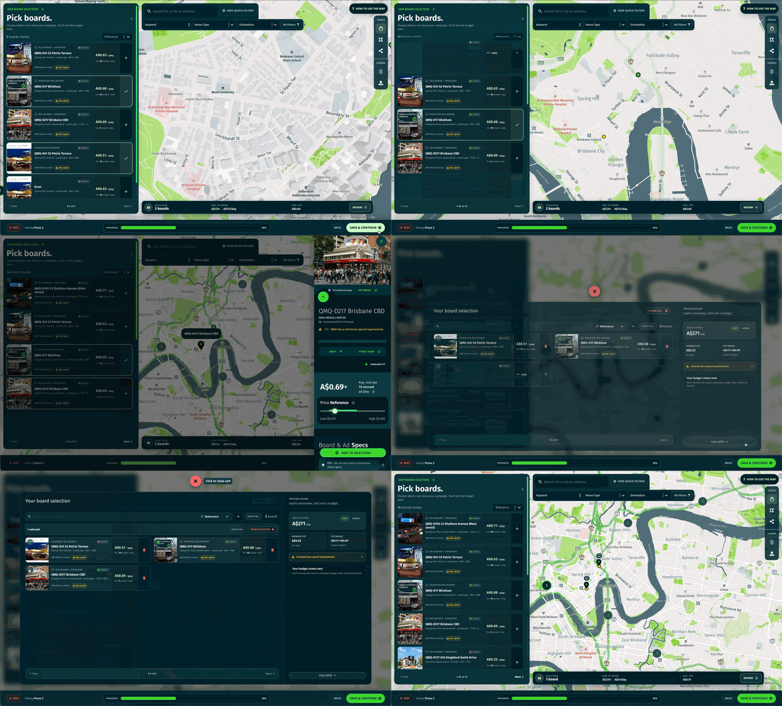
The board map, results list and selection cart have all been reworked.
Board cards now show more useful availability, publisher, venue and pricing information without demanding quite so much screen space. Selected boards can also be searched, sorted and reviewed more easily.
On mobile, you can switch cleanly between the map and list, inspect clusters of nearby screens, and manage your selection without attempting to tap a five-pixel target with a finger.
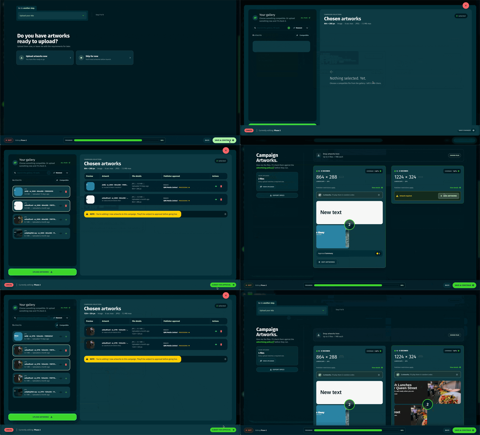
The artwork workflow has been rebuilt to provide a clearer account of what your selected boards actually require.
You can now see:
Uploading new artwork and choosing something from your existing gallery now live within the same, cleaner workflow. The artwork library also has improved search and can locate files using publisher information.
Campaign management has received a fairly comprehensive renovation.
The new campaign overview brings delivery, spend, projections and funding information into a clearer structure. Performance reporting has improved date controls, cleaner graphs and more useful summaries for plays, audience, screen time and spend.
When delivery needs attention, I can now provide more detailed board-level diagnostics and suggest an appropriate next step - assuming the available evidence permits one.
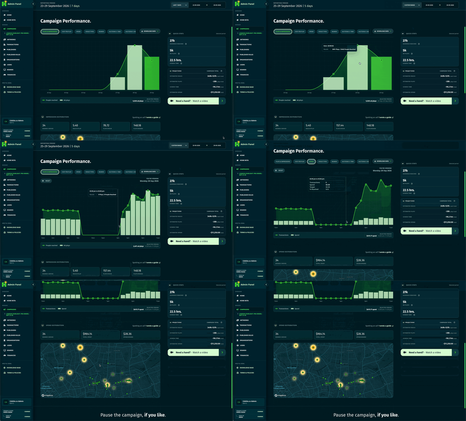
The previous mobile experience did technically exist. May it rest in peace.
Navigation, campaign creation, campaign management, artwork uploads, reporting and organisation settings have now been redesigned for smaller screens.
This includes:
You should now be able to manage a campaign from your phone without feeling as though you are remotely operating a desktop through a letterbox.
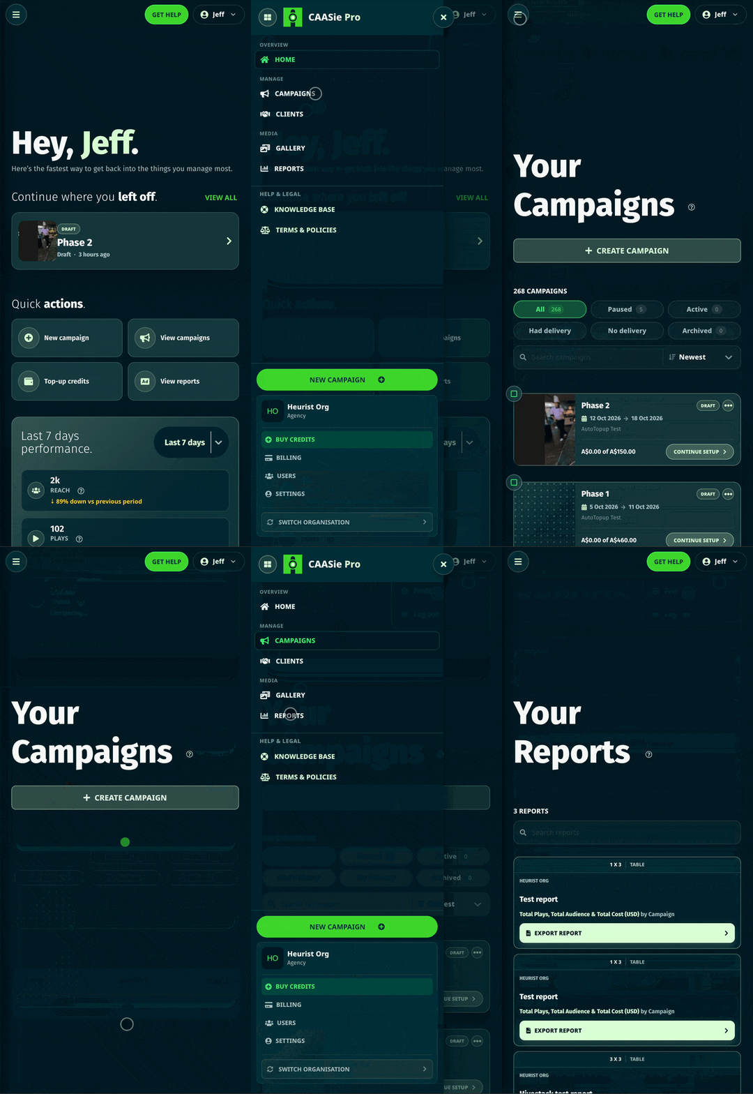
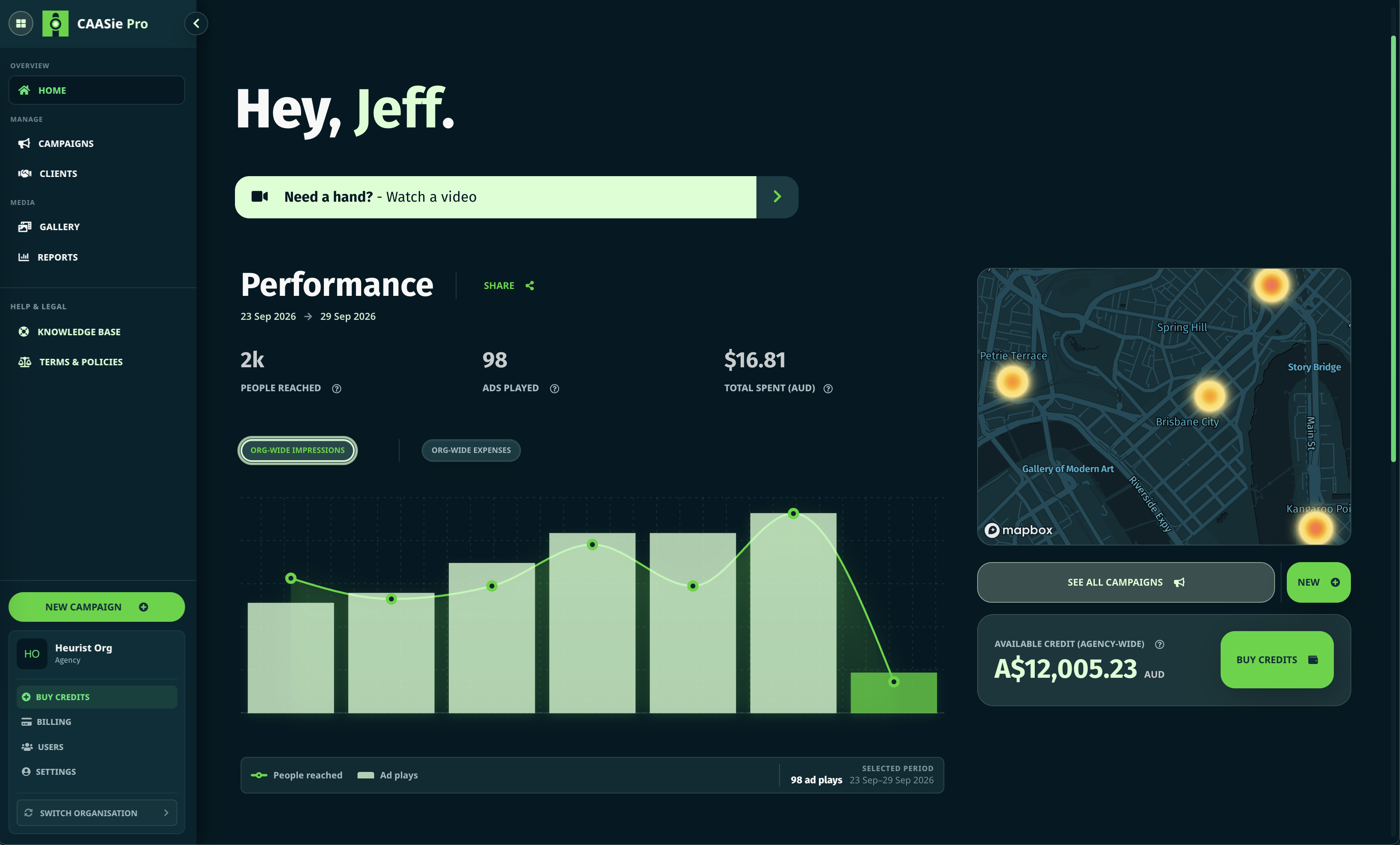
The home dashboard has also been reorganised, particularly on mobile.
Performance can now be reviewed across today, yesterday, the last seven days, the last 30 days or a custom range. I can also compare the selected period with the previous equivalent period, providing useful context without requiring mental aerobics.
Recent campaigns, summary statistics and graphs have all been cleaned up accordingly.
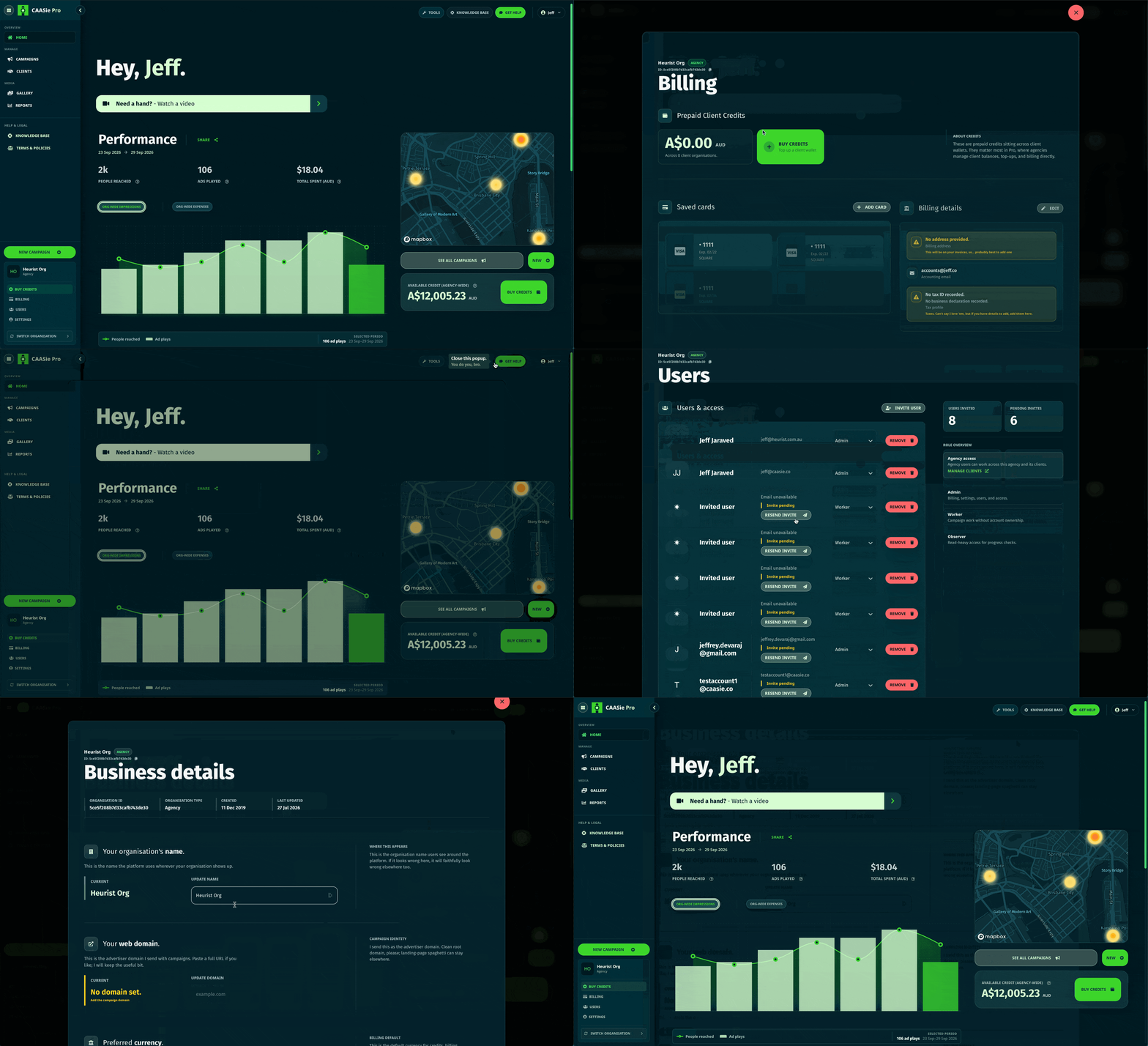
Organisation settings, billing, funding, clients and team management have been consolidated into a clearer workspace.
Switching organisations is more reliable, payment and billing controls are easier to understand, and common account actions no longer require an unnecessary journey through several unrelated screens.
There is also a new navigation system across the wider platform, with more consistent access to organisation settings, profile controls and primary actions.
There are also several smaller improvements that did not demand their own dramatic heading:
These updates will be live shortly.
A refresh may be required after deployment because browsers remain deeply committed to preserving obsolete JavaScript. If anything continues behaving strangely, the team is available and has already accepted its fate.